
ITERATIONS
USABILITY TESTING
The flows tested were:
Create an account and add a shopping partner
Navigate to the Zillow account section in the inbox
Adding a partner in the Zillow account section and sending them an invitation
Finding the acceptance message in the inbox
Navigating to the saved homes list and finding the homes you've both saved list
Navigating to and comparing the homes you've both saved
Usability Test Results:
All users were able to create an account and add a shopping partner
2 of the 5 users were able to navigate to the Zillow account section in the inbox
2 of the 5 users were able to add a partner in the Zillow account section and sending them an invitation
2 of the 5 users were able to find the acceptance message in the inbox
All users were able to navigate to the saved homes list and finding the homes you've both saved list
All users were able to navigate to and comparing the homes you've both saved
Pain points for iterations:
2 of 5 users had a difficult time finding the account section in the original UX design.
I tested my wireframes with 5 of the original users. These users have all interacted with the Zillow App previously.
Iterations made included:
Creating a profile icon for the navigation menu to make finding the user's profile much more user friendly.

We've made it to the end … almost
WIREFRAMES
PROTOTYPE
Starting with low fidelity wireframes, I utilized the same brand standards Zillow set forth. I added in a section to add a shopping partner to your account, the saved homes list, as well as a way to compare the homes the users have both saved.
Lastly, I put together the final prototype for usability testing. I wanted to test multiple different flows including navigating the dashboard, the add a partner page, the invite confirmation page, as well as the home comparison pages.


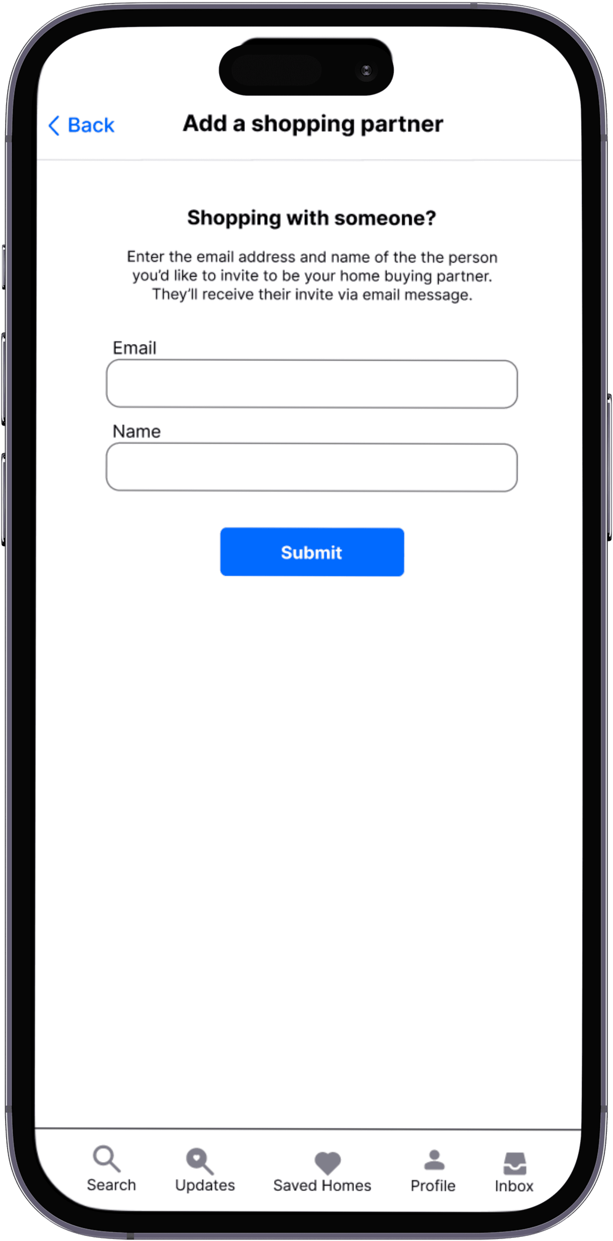
Users can login to their account and add a shopping partner.
ADD A PARTNER
CONFIRMATION
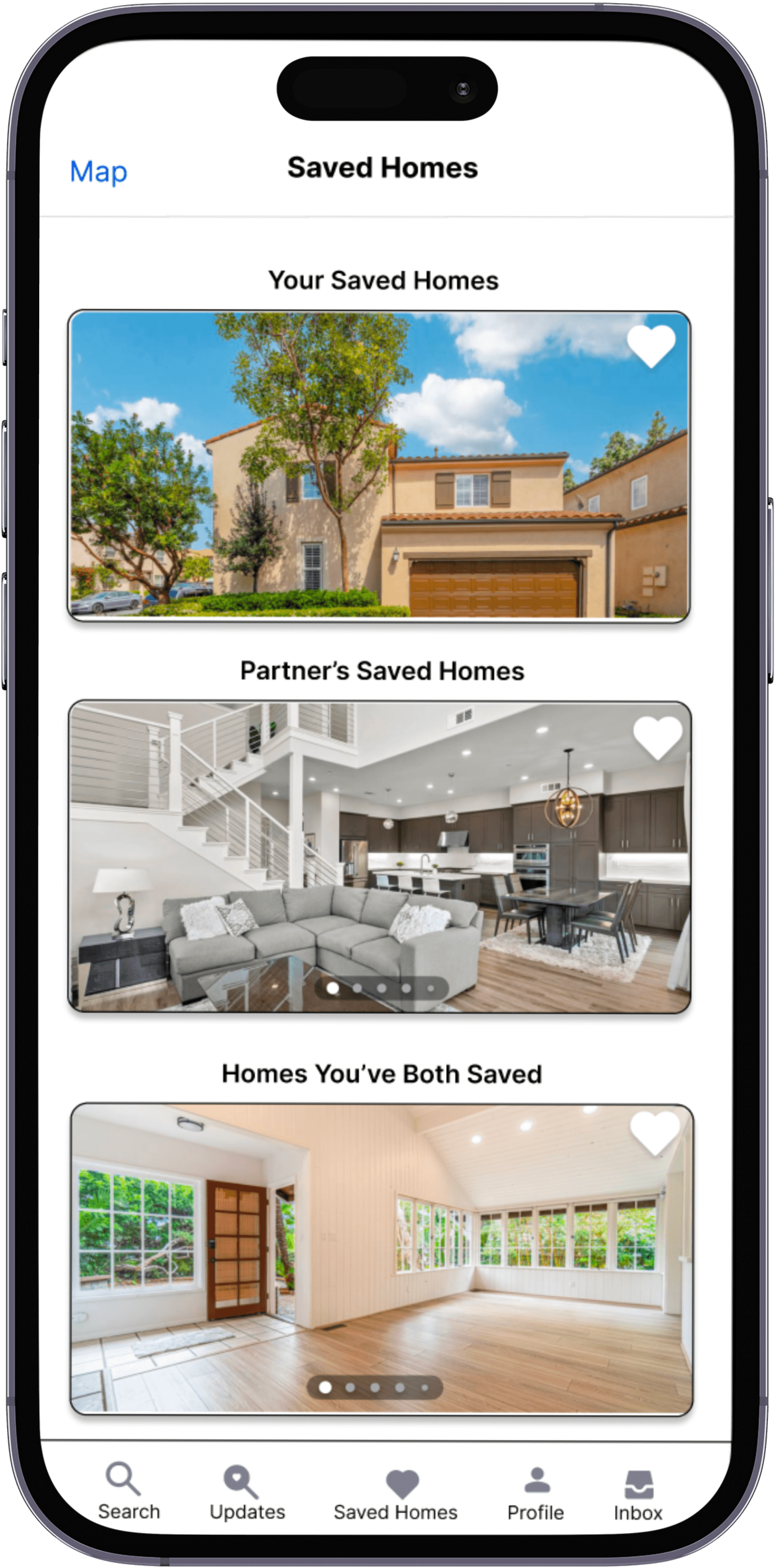
SAVED HOMES
COMPARE HOMES
Users will get a confirmation message in their inbox after the shopping partner accepts their invitation.
Users can see homes saved lists for their own, their partner, as well as the homes they've both saved.
Users can compare the homes both partners have saved.

Next up, all things design
While house hunting, I noticed how difficult it was to keep the homes I was interested in organized. I also found it difficult to share and keep track of the homes my partner found as well. I wanted to find out if others felt the same pain points.
WHY?
USER RESEARCH
THE PERSONA
I started with interviewing a group of 5 other users currently searching for a home with a partner.
How are you conducting your current home buying search?
How do you share the homes you've found with your partner?
What is the biggest pain point in your home buying search?
INTERVIEW QUESTIONS:
KEY INSIGHTS:
Trulia
Realtor
Redfin
Users noted that they currently use a mix of online home buying apps as well as consulting with realtors.
Most users stated that they text homes they've found to their partner, with one user noting they orgainze those homes with Google Sheets.
Users noted that they feel that organizing the homes they've found is the biggest pain point, as well as being able to easily compare those saved homes with ones their partner has saved.

COMPETITIVE ANALYSIS
I conducted a competitive analysis of other home buying apps currently available to users. I noticed that the three other top competitors all have options to add a shopping partner to their account, as well as being able to see the homes they've saved.


THIS IS HOLLY
SHE IS CURRENTLY HOUSE HUNTING WITH HER FIANCE
BIO:
NEEDS + GOALS:
FRUSTATIONS + PAIN POINTS:
QUOTE:
An organized home buying experience
A way to share homes with her partner
Losing track of homes she loves
Sharing homes is clunky and not efficient
“I find it very difficult to keep track of all the homes I love and make time to go see them before they’re sold.”
Holly is a busy working mother looking to find her forever home with her fiance and children. She finds it difficult to find and see home before they are off the market.
First things first…
THE BRIEF
Design a feature to add to an existing website
THE ROLE
I was the sole UX/UI Researcher and Designer
THE TIMELINE
The timeline given was 2 weeks

FEATURE SET
I started brainstorming ideas that would best suit a user like Holly. I asked myself which features would make it to the top of this list and be the most efficient for the overall user experience.
MUST HAVE
NICE TO HAVE
SURPRISING
Create an account
Adding a shopping partner
Separate lists for each partner
Home comparisons
Open house alerts
Pros and Cons list
USER FLOWS
Next, I wanted to see how users would be walking through the application, which is when I created the user flows.
