ITERATIONS
USABILITY TESTING
The flows tested were:
Homepage - Users should be able to easily read and navigate the homepage
Services - Users should be able to find specific services offered and request an appointment
Team - Users should be able to find information about the dental team
Patients - Users should be able to find information about financial options, reviews, paperwork, + photos
Financial - Users should be able to find information about insurance and membership plans
Contact - Users should be able to find the contact form, hours of operation, map, and contact information
Usability Test Results:
100% of Users found the site design to be calming and not overwhelming
100% of Users were able to easily find contact information, services, patient information, and patient reviews
80% of Users were able to request an appointment (1 user did not realize the contact form was also to request an appointment)
100% of Users were able to send a message
Pain points for iterations:
2 of the 5 users were unable to request an appointment using the contact us form.
I tested my wireframes all 5 of the original users who are current dental patients of the office. They are also familiar with the original brand and website design.
Iterations made included:
Create a more visible to way to show that the contact form is also to be used to request an appointment.


We've made it to the end … almost
BRANDING
WIREFRAMES
PROTOTYPE
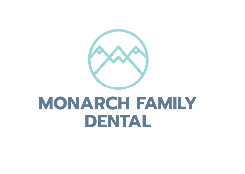
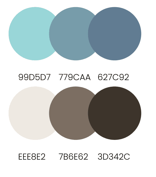
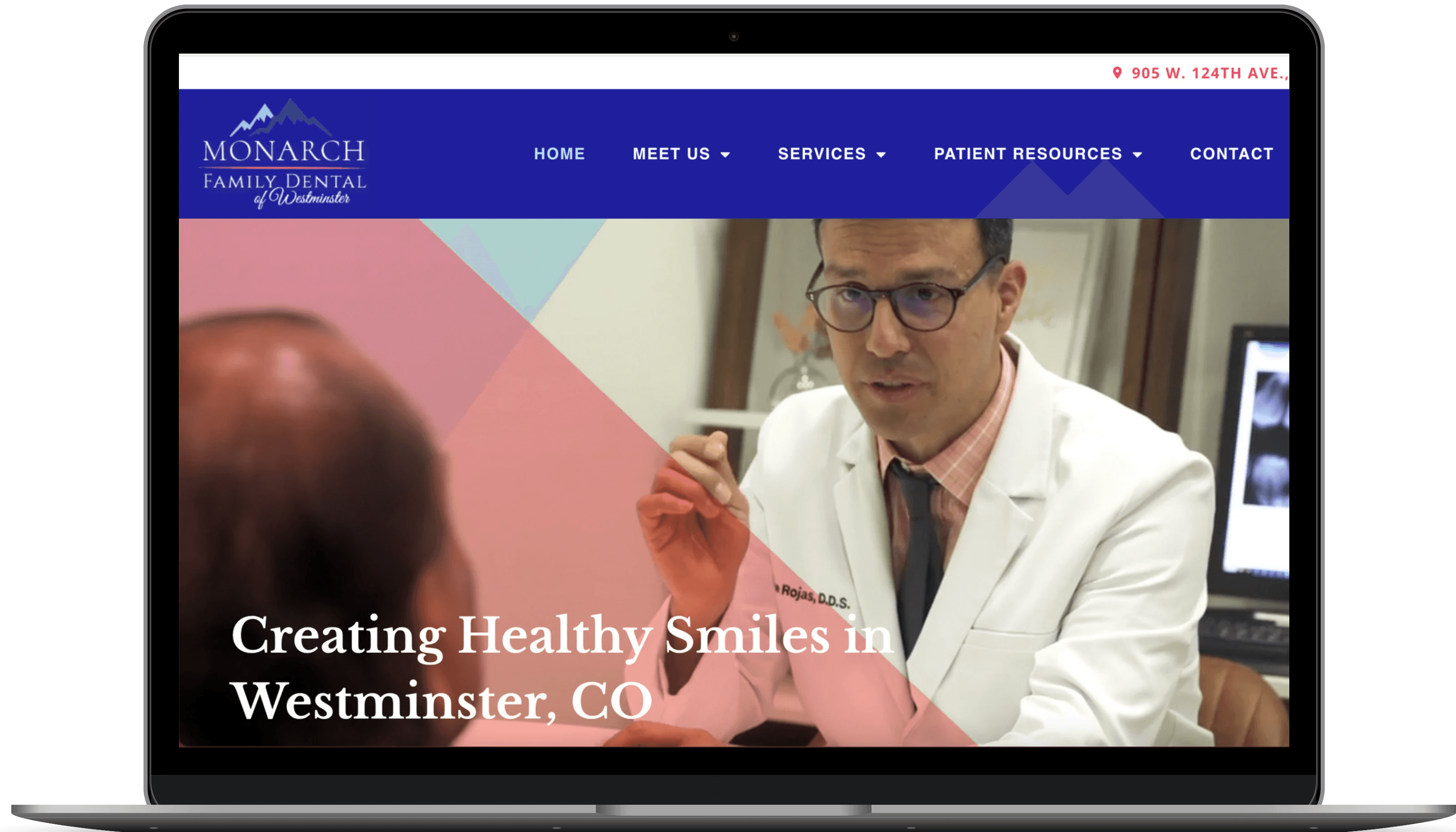
Taking into consideration that I am working with an existing company, I utilized the same name for the rebrand, but chose a new color story, logo, and typography that would be more legible for patients to read.
I started with a very basic layout for my low fidelity wireframes. I laid out the flows to be as stress free as possible.
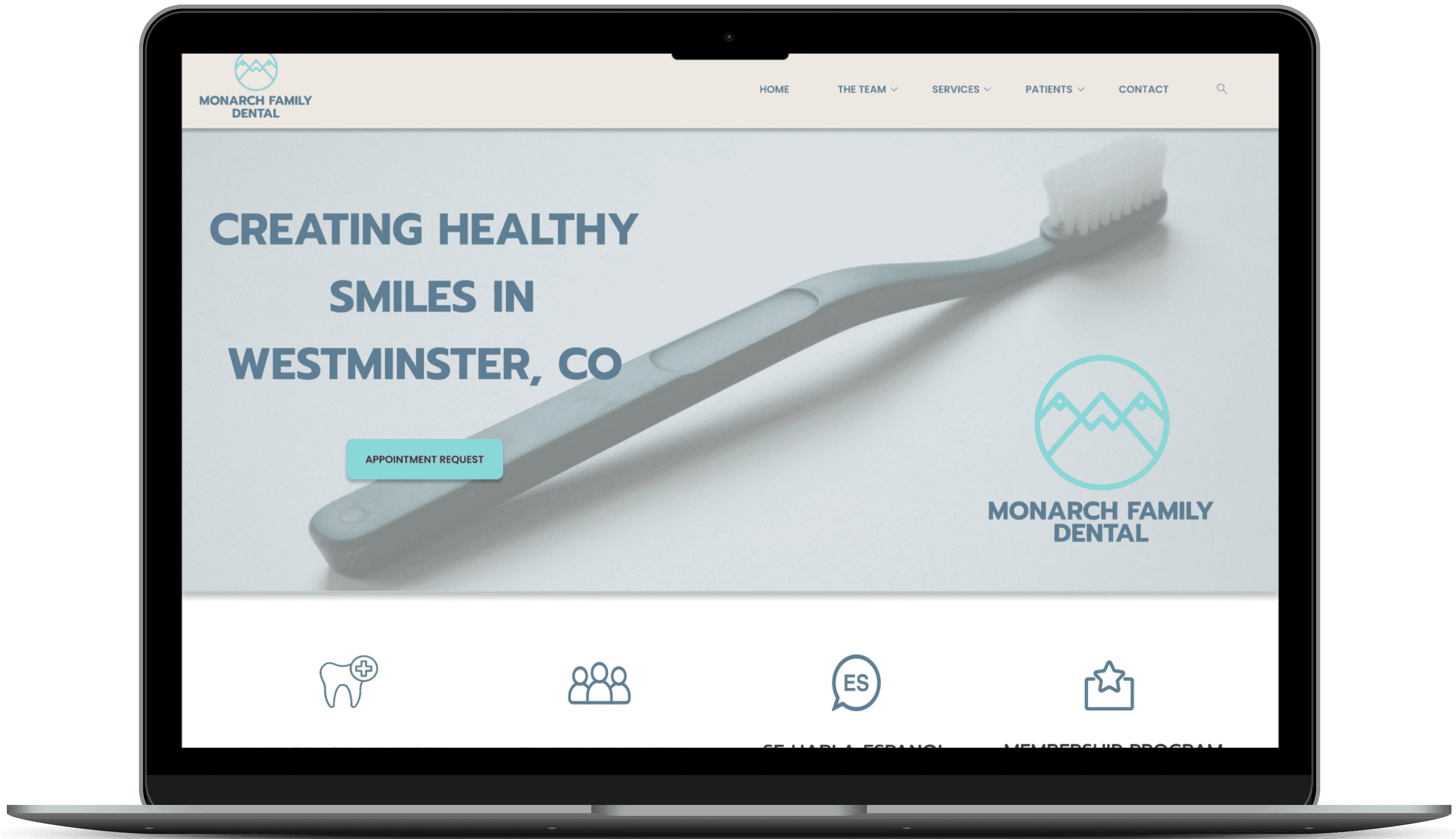
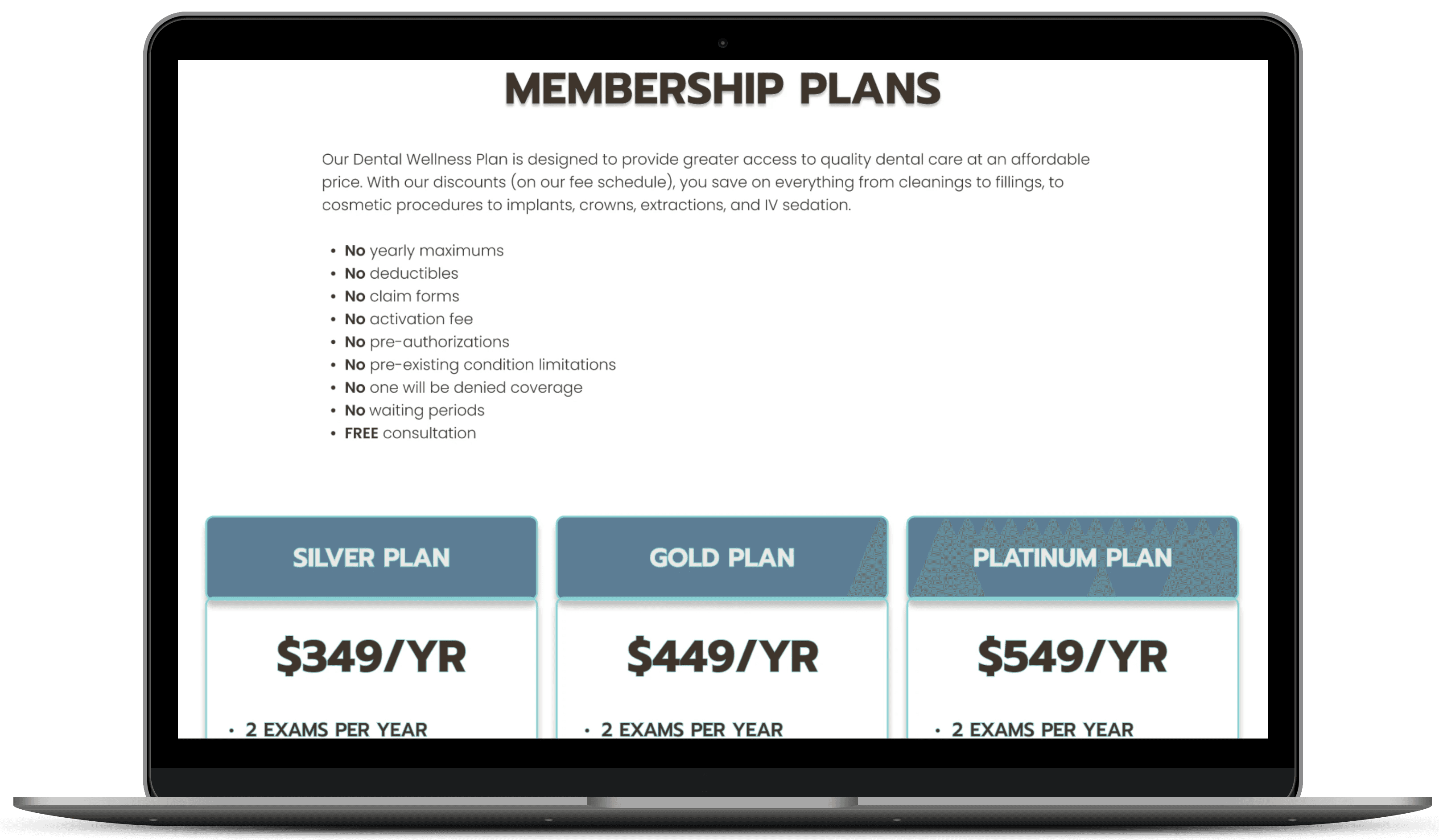
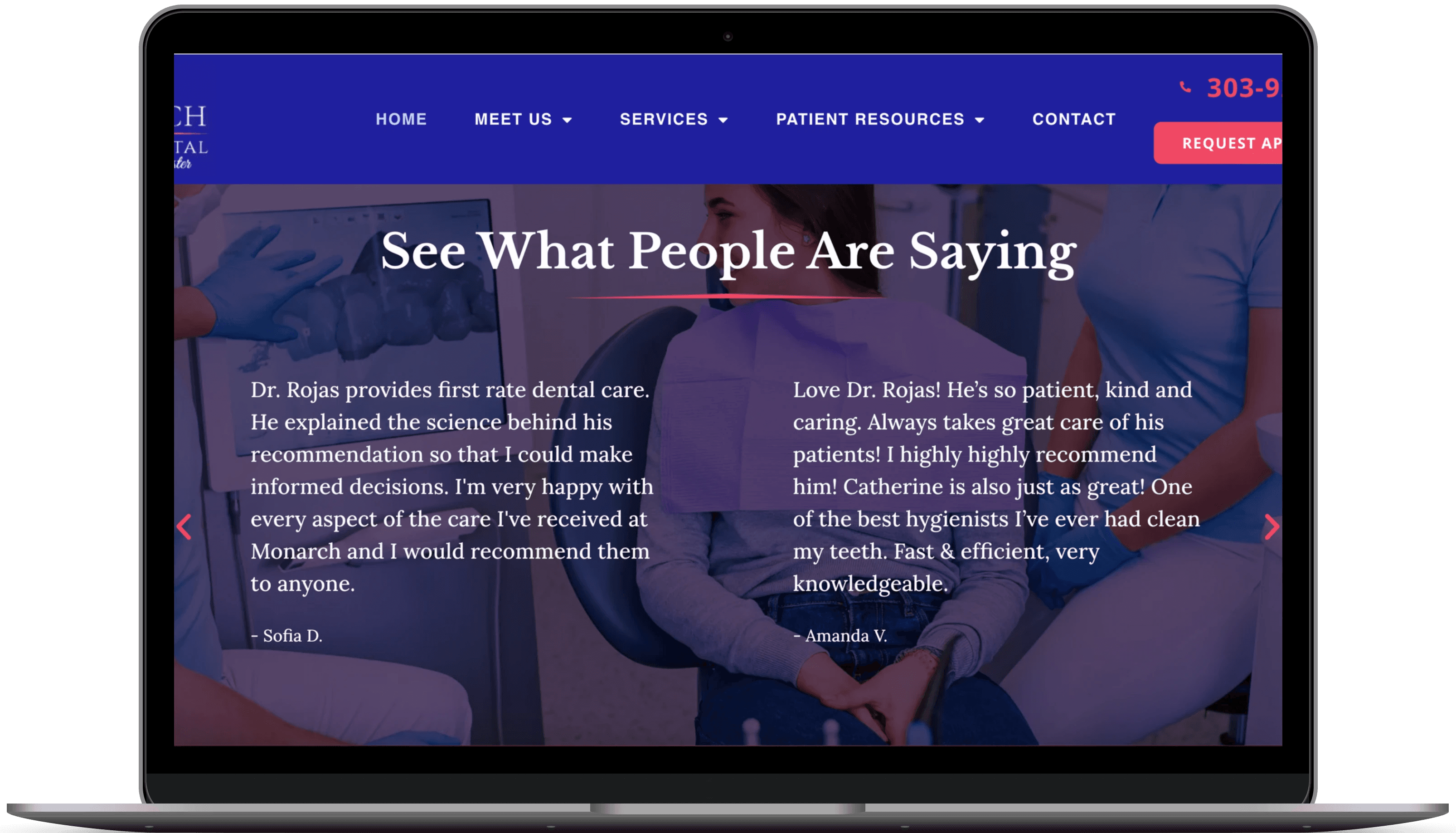
Adding in the updated brand standards to the site, you can see the high fidelity wireframes come to life.
Lastly, I put together the final prototype for usability testing. I wanted to test multiple different flows including navigating the homepage, the services page, as well as the patients page.
Users should be able to easily read and understand the homepage with the updated brand standards and color story.
HOMEPAGE
SERVICES
PATIENTS
Users should be able to navigate to and find different services offered by the dental office.
Users should be able to find pertinent information regarding insurances accepted as well as the office's in-house membership plans.


Next up, all things design
A local dental office reached out to see if I could assist with a brand and website redesign. They felt as though they were missing out on new patient opportunity with their current branding and UX.
WHY?
USER RESEARCH
THE PERSONA
I started with interviewing 5 users familiar with the existing brand and website design.
How does this website make you feel if you were looking for a new dental office in your area?
Do you feel that this website is easy to read and understand?
Do you feel that this website is easily navigable?
INTERVIEW QUESTIONS:
KEY INSIGHTS:
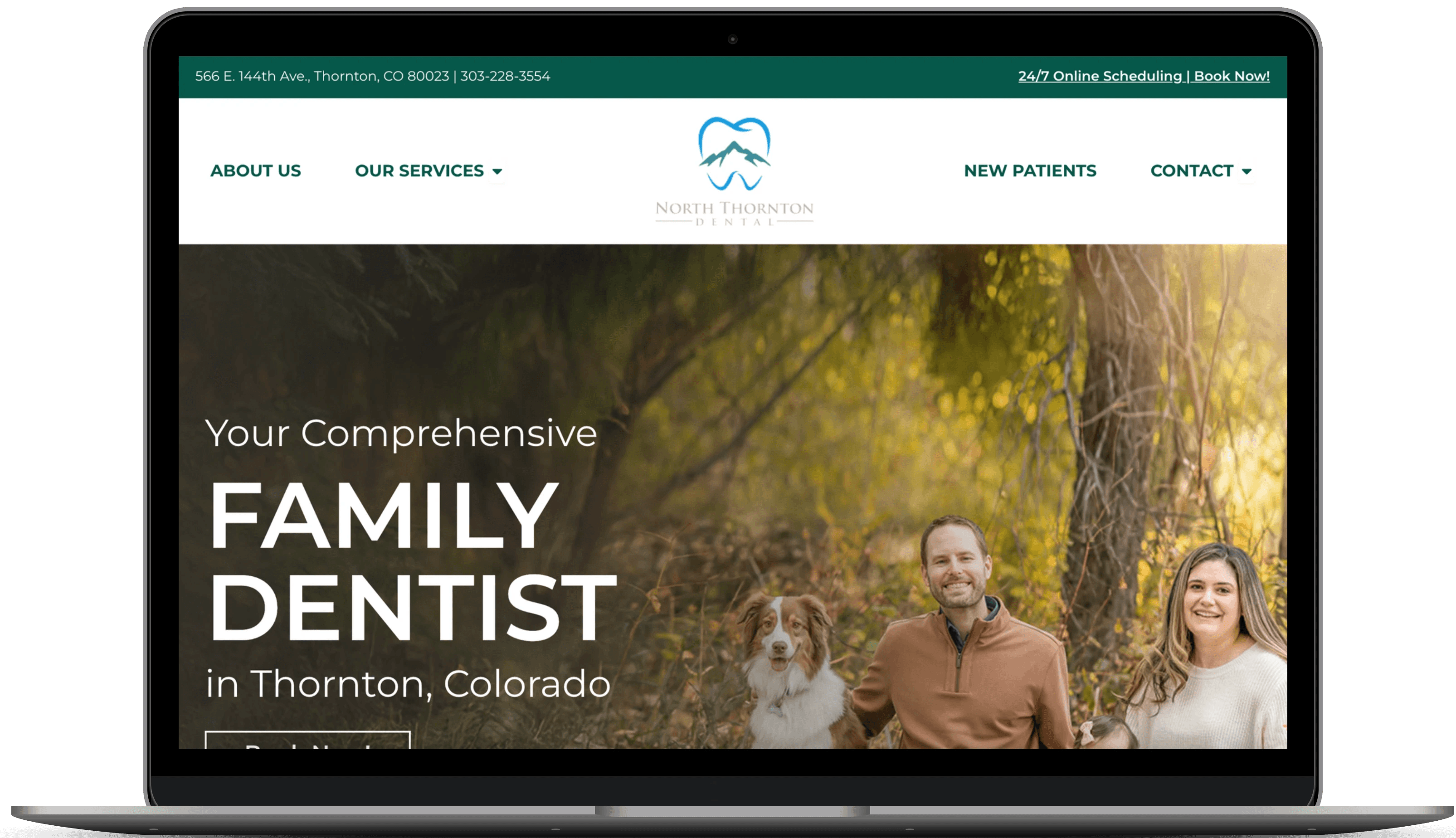
Erie Modern Dentistry
North Thornton Dental
Cope Family Dental
Users noted that the current website doesn't feel like a dental office but more industrial.
Users stated that the website is difficult to read and understand with the current typography and color story.
Users felt like the website is easy enough to navigate but could be better.

COMPETITIVE ANALYSIS
ORIGINAL DESIGN:
I conducted a competitive analysis with other dental offices in the local area. I noticed they had a range of options listed for services, how to schedule, and their color stories were very similar.


THIS IS GISELE
A CURRENT DENTAL PATIENT
BIO:
NEEDS + GOALS:
FRUSTATIONS + PAIN POINTS:
QUOTE
A calming environment
A modern office with new technology
An easy scheduling process
Dental anxiety during visits
Difficulty navigating websites
Difficulty scheduling appointments
"It’s hard to find a dental office with friendly staff + a modern setting. I wish it was easier to find and schedule an appointment online.”
Giselle is a dental patient who suffers from dental anxiety. She wants to find an office that has a friendly staff and calm environment.
First things first…
THE BRIEF
Redesign + Rebrand a local dental company's website
THE ROLE
I was the sole UX/UI Researcher and Designer
THE TIMELINE
The timeline given was 2 months

FEATURE SET
I started brainstorming ideas that would best suit a user like Giselle. I asked myself which features would make it to the top of this list and be the most efficient for the overall user experience.
MUST HAVE
NICE TO HAVE
SURPRISING
Online scheduling option
Calming colors + legible typography
List of services offered
List of insurances accepted
About the team page
Reviews section
Before + after photos
Live chat during business hours
Photos + bios of providers
New patient forms
Ability to pay online
USER FLOWS
Next, I wanted to see how users going through the website, and how I could make the process as stress free as possible. I removed some redundancy in the user flow by combining similar information into the same page.
